
Extract from Statistics South Africa, Census 2011: Statistical Release, October 30 2012
3.1 Demographic characteristics
3.1.1 Introduction
A Census is the basic source of demographic information at all levels of geography in a given area at a defined time. This chapter provides information on size, composition and structure of the population of South Africa from 1996-2007.
3.1.2 Population size
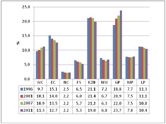
Figure 3.1 indicates that the population size of South Africa has increased noticeably from 40,5 million in 1996 to 51,7 million in 2011. KwaZulu-Natal, followed by Gauteng had the majority of population in both the two Censuses (1996 and 2001), but was overtaken by Gauteng during C S 2007, leaving KwaZulu-Natal to take second place.
However, there was a noticeable increase in the share of the population in Gauteng from 18,8 % in 1996 to 23,7%
in 2011 while the share of the population in KZN remained almost constant (21,1% in 1996 to 19,8% in 2011).
Amongst all the provinces, Northern Cape had the lowest share (2,5% in 1996 and 2,2% in 2011). Eastern Cape on the other hand showed a marked decline from 15,1% 1996 to 12,7% in 2011.
Figure 3.1: Percentage distribution of population by province, 1996-2007
***
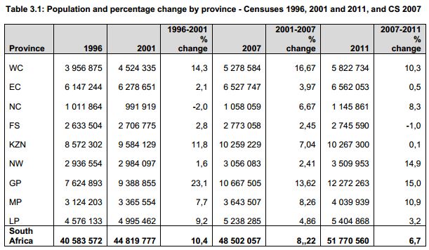
Table 3.1 provides the provincial percentage share of the total population in four periods (1996-2001, 2001-2007 and 2007 to 2011). The results show a noticeable decrease of -2% in the percentage share of the total population of Northern Cape from 1996 to 2001 that increased to 8,3% in 2011. Gauteng, Western Cape and KZN show a marked decrease of the population share of 15%, 10,3% and 0,1% in 2007 to 2011 respectively.
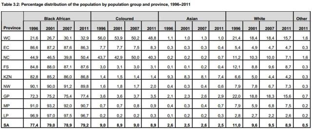
Table 3.2 indicates that Black African population group has the highest proportion of over 70% in all provinces with the exception of Northern Cape and Western Cape where the percentages were 32,9% and 50,4%, respectively 2011. On the other hand, Coloured population is the highest in the Northern Cape and Western Cape.
However, the figure shows a decreasing pattern in Northern Cape of 43,7% in 1996 to 40,3% in 2011 and 56% to 48,8% in Western Cape. The highest percentage of Indian or Asian population is found in KwaZulu-Natal. The percentage of this population in the province was 9,3% in 1996 and 7,4% in 2011. Western Cape province and Gauteng had the highest percentages of the White population at 21,4% and 22% in 1996 which declined to 15,7% and 15,6% respectively.
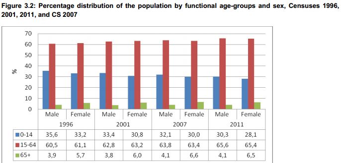
Figure 3.2 indicates that from 1996 to 2011 the proportion of the population aged 0-14 for both males and females decreased. The male population in this age group decreased from 35,6% in 1996 to 30,3% in 2011 whilst that of female population decreased from 33,2% to 28,1%. The proportion of economically active population (15-64) increased for males from 60,5% in 1996 to 65,6% in 2011. That of females increased from 61,1% in 1996 to 65,4%.
3.2 Population composition
Figure 3.3: Percentage distribution of the population by sex, Censuses 1996, 2001 2011 and CS 2007
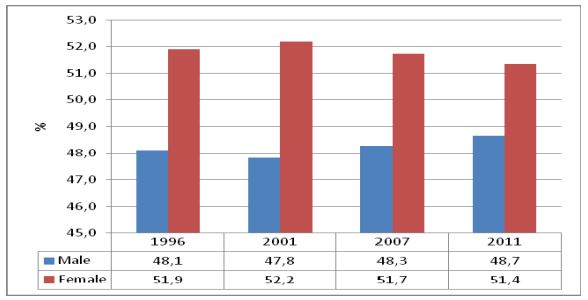
Figure 3.3 presents the percentage distribution of the population by sex in the three Censuses and CS 2007.
Overall; the results indicate that the population is predominantly female. On average, the population consists of 48,2% of the male population and 51,7 % of the female population
3.3 Sex ratio
Sex ratio is one of the key measures of sex composition. It gives the number of males for every 100 females. If it is above 100, it shows the predominance of males over females, conversely when it is lower than 100, the reverse is true. Generally sex ratios at birth are high and decrease gradually as age increases.
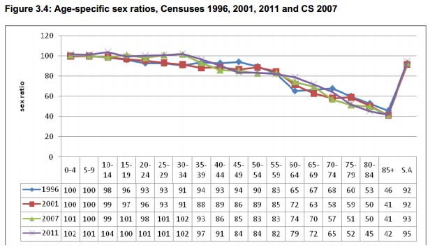
Figure 3.4 indicates that the overall sex ratio increased from 92 in 1996 to 95 in 2011. In general, more males are born than females hence sex ratios above 100 are expected at younger age groups. The table further indicates an unexpected pattern of sex ratios of 93 and 91 at ages 25-29 and 30-34 in 2001 that increased markedly to 101 and 102 in 2007 and remained the same for 2011.
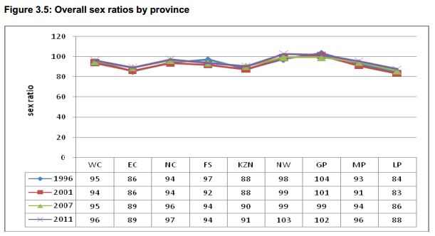
The results in Figure 3.5 show that among all the provinces, GP and NW had the highest sex ratios of over 100 in 2011. NW had a sex ratio of 98 in 1996 that increased to103 in 2011. Conversely, Limpopo and Eastern Cape had sex ratios lower than 90 across the years. Evidence from 1996 and 2001 Censuses showed that the two provinces (Limpopo and Eastern Cape) were the most affected by outmigration in terms of inter-provincial migration.
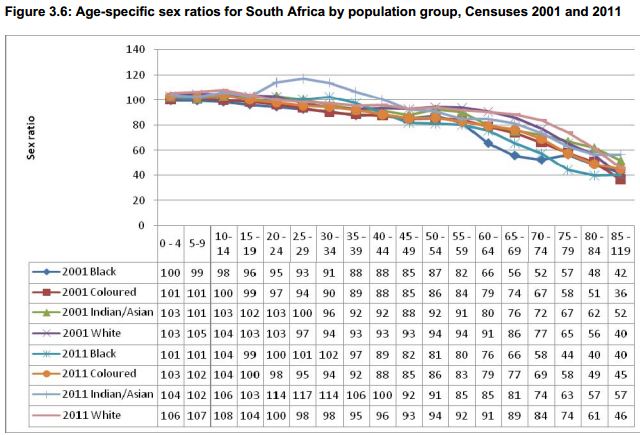
Figure 3.6 indicates an even pattern of age specific sex ratios of population groups in 2001 and 2011 that begins to decline as age increases. In contrast, age specific sex ratios for the Indian population in 2011 shows considerable increases from ages 20-24, 25-29 and 30-34 of 114;117 and 114 respectively.
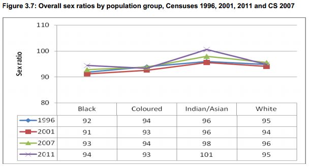
Figure 3.7 indicates a stable but increasing pattern of sex ratios ranging from 92 in 1996 to 94 in 2011 for the black African population group. The coloured population group sex ratios fluctuated between 93 and 94 in all the four points. However; sex ratios for the Indian population show considerable increase from 96 in 1996 to101 in 2011.
3.4 Median age
Generally median age gives an indication of whether the population is young, old or intermediate. Shryock et al (1976) described a population as being young when it has a median of less than 20 and those with medians of 30 and above as being old. Those with median ages between 20 and 29 are referred to as populations of intermediate age
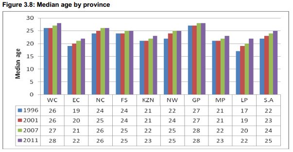
Figure 3.8 indicates that the overall median age in South Africa was 22 (1996), 23 (2001), 24 (2007) and 25 (2011) respectively. This implies that South Africa had intermediate populations in the four periods. Gauteng, followed by Western Cape had higher but consistent median ages over time, whilst Limpopo and Eastern Cape had lower median ages of 20 and lower than 20 in 1996 to 2001 that steadily increased to 22 in 2011.
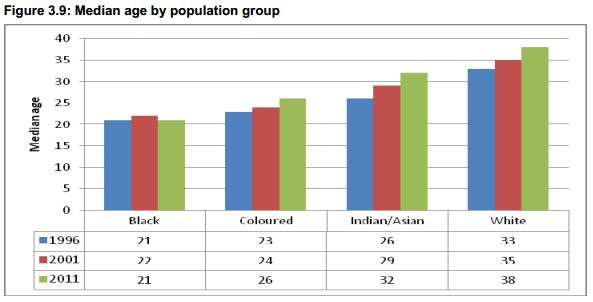
Although South Africa's population had the median age of between 22 and 25 in the period 1996-2011, the results pertaining to the four main population groups show a different pattern. Figure 3.9 indicates that the white population had a relatively old population with an increasing median age from 33 to 38 from 1996 and 2011 respectively. On the other hand, Black African and the Coloured populations' structures were predominantly intermediate with the median ages ranging from 21 to 26.
3.5 Population structure
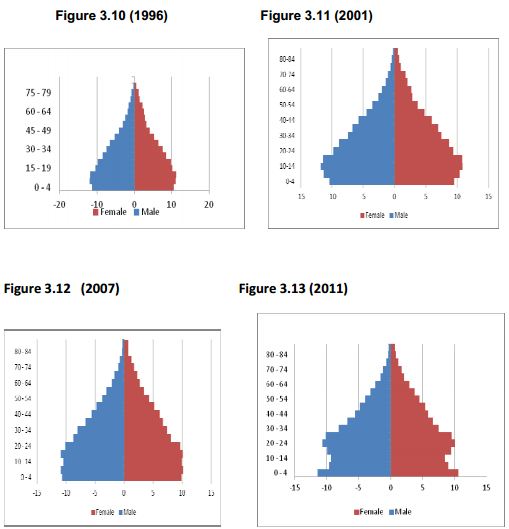
Knowledge about the age-sex distribution of a population is valuable information on demographics and socioeconomic concerns. Amongst its importance, it can be used to evaluate, adjust the completeness and accuracy of Census counts. Figures 3.10 to 3.13 show the pyramids for the three Censuses and the CS 2007 at national level.
Nationally, the figures show that there was a fairly large proportion of females than males in all age groups except for younger age groups where the proportion of males is higher than females. The population in 1996, 2001, and 2007 began to increase from 5-9 age groups and decreased as age increases. Contrary; in 2011, there was a marked decrease of males and females aged 5-9 and 10-14. Many factors could have contributed to this decrease. Further analysis is scheduled to be done to ascertain the key drivers to this occurrence.
3.6 Concluding remarks
The population of South Africa increased from 40,5 million in 1996 to 51,7 million in 2011.
Age-sex distribution indicates a marked decline of both males and females at ages 5-14.
The provincial share of the population indicates an increase of population in Gauteng from 18,8% in 1996 to 23,7% in 2011, and a decrease in KwaZulu-Natal.
Among the population groups, black African population constitutes more than 75% during the four periods.
Provincial sex ratios suggest that Limpopo and Eastern Cape consistently had sex ratios lower than 90 in the Censuses 1996, 2001, 2011 and CS 2007.
Functional age group pattern show that 0-14 age group for both males and females decreased whilst those of the economically active population (15-64) increased over time.
The full document can be accessed here - PDF.
Click here to sign up to receive our free daily headline email newsletter