What Does The 2016 Community Survey Tell Us About Immigration And Emigration Of The Foreign Born?
13 April 2017
Introduction
The movement of foreign born people into and out of South Africa and the number of foreign born residents have been contentious issues for decades, at statistical, sociological and policy levels. The purpose of this brief is to consider evidence from the 2016 Community Survey against the background of the 2011 Census in order to construct a statistical account. For reasons discussed below, the best that can be offered is a reasonable conjecture.
A basic distinction is between residents, legally or illegally present, and transients (short-term visitors). This study is concerned only with residents, and transients in the Census and Community Survey are dropped from the data sets.
The analysis
The first problem is that the Census 10% sample (2015 revision) and the Community Survey are not demographically coherent. The adjustments needed to make them coherent are described in the Appendix. All estimates here are based on the adjusted data.
It should be noted that there is no adequate direct measure of emigration. The Community Survey asked households whether one or more of their members left South Africa since 2006, and an estimated 79 902 households (0.5% of the total) said that they had. But the interval is longer, there is no distinction between South African born and foreign born, the number of people reported leaving is unknown (since more than one person per household may have left), and households which have left in their entirety are not recorded at all. So emigration has to be indirectly estimated.
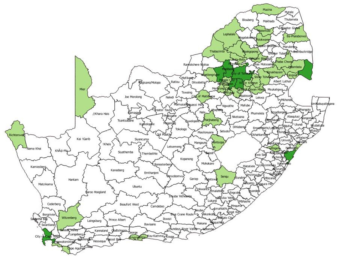
Figure 1 displays the percentage of the population by age that was foreign born in 2011 and 2016. Concentrate initially on the Census 2011 (the blue line) and the Community Survey 2016 (the orange line). The 2016 line is well below the 2011 line, suggesting that the proportion of foreign born residents in the total has dropped quite sharply between 2011 and 2016. The question is whether this result is plausible.
To explore the issue, consider the population equation for foreign born residents. We have estimates of the foreign born population in 2011 and 2016. We can also identify the immigrants who have arrived between the beginning of 2012 and April 2016 and can adjust them upwards to represent immigration over a five year period. So we can estimate Emigration plus Deaths from the population equation. Either way, these people have left South Africa, for either another country or another planet. It is important to note that emigration is estimated indirectly using the population equation.
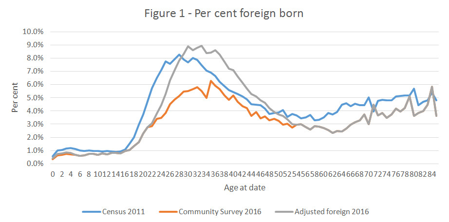
Figure 2 sets out immigration and emigration/death of foreign born residents between 2011 and 2016, expressed as a percentage of the resident population. Immigration is represented by positive numbers (the blue line) and emigration by negative numbers (the orange line).
Here, the second problem becomes visible. The rate of emigration in the 20-55 age range is implausibly high, given that this is the prime working age range. So an alternative account is constructed by making the emigration rate decline linearly from its 20 year old level to its 55 year old level. The alternative account is represented by the grey line in Figure 2. Corresponding to the alternative assumption about emigration and death, a revised estimate of the foreign born between the ages of 20 and 55 is represented by the grey line in Figure 1. The grey and orange lines together are not far from the blue line, though the peak is slightly higher and the age at the peak slightly older.
The population equation for the foreign born is set out in Table 2 and for the South African born in Table 3.
|
Table 2 - Foreign born population equation |
|
|||
|
|
|
|
|
|
|
Present in 2011 |
|
|
2 010 842 |
|
|
Percent of total population in 2011 |
3,8% |
|||
|
Immigration 2011-2016 |
|
466 662 |
||
|
Emigration/death 2011-2016 original |
-930 568 |
|||
|
Emigration/death 2011-2016 alternative |
-466 662 |
|||
|
Difference between alternative and original |
463 907 |
|||
|
Present in 2016 original |
|
1 541 700 |
||
|
Percent of total population in 2016 |
2,8% |
|||
|
Present in 2016 alternative |
|
2 010 842 |
||
|
Percent of total population in 2016 |
3,7% |
|||
|
Table 3 - South African born population equation |
||||
|
|
|
|
|
|
|
2011 |
|
50 222 159 |
|
|
|
Births |
|
5 577 800 |
|
|
|
Death |
|
3 348 800 |
|
|
|
Natural increase |
2 229 000 |
|
|
|
|
Net immigration |
0 |
|
|
|
|
|
|
|
|
|
|
2016 |
|
52 451 159 |
|
|
The alternative assumption implies that there were just over two million foreign born residents in South Africa in both 2011 and 2016, representing just under 4% of the total population.
What accounts for the discrepancy between the original and alternative estimates? Two hypotheses, with different statistical implications suggest themselves:
1. The enumeration avoidance hypothesis. Some foreign born residents may take particular care to avoid enumeration, especially if they are in South Africa illegally. Some may have avoided enumeration in both the Census and the Community Survey, in which case, the estimates in Table 1 are too conservative. As indicated in the Appendix, one has to assume that enumeration avoidance was more severe in 2016 than it had been in 2011 to explain the pattern reflected in Table 1.
2. The self-naturalization hypothesis. This hypothesis is that some foreign born residents over time, especially if they speak a South African official language (English, Isindebele, Sesotho, Setswana, Xitsonga) and find their way by one means or another to South African documentation, come to return themselves in censuses and surveys as South African born.
The first hypothesis implies that the estimate of 460 000 additional foreign residents under the alternative assumption should be added to the estimate of the population. The second hypothesis implies that 460 000 people returning themselves as South African born were, in fact, foreign born, and there should be no addition to the total population estimate. The evidence for the second hypothesis is that the calculated survival rates for the South African born population age 20 to 55 are higher than those obtained from the UN life table for the period 2010-2015. If anything, they should be slightly lower since there will have been emigration of South African born in this age range.
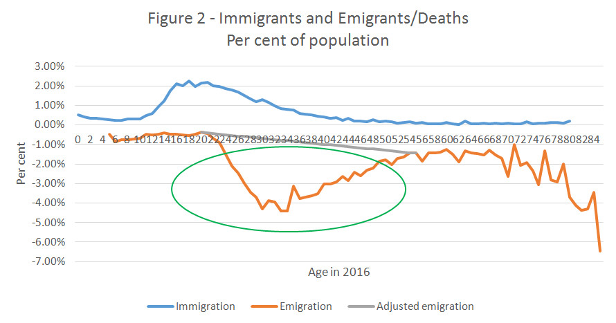
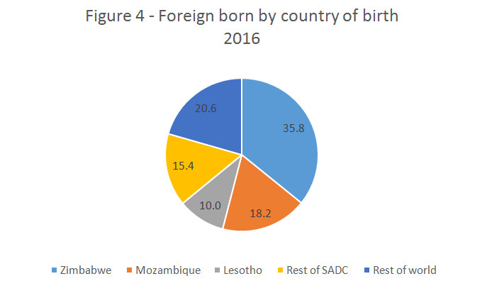
From which countries do foreign born residents come? Figures 3 and 4 present pie charts, displaying the distribution of countries of origin of the foreign born. The single biggest supplier by far in both 2011 and 2016 is Zimbabwe. Applying the percentage distribution of the foreign born to the (alternative) estimates in Table 1, 710 000 people born in Zimbabwe were resident in South Africa in 2011, and 740 000 in 2016. Mozambique is the next largest supplier, with 400 000 people born there resident in South Africa in 2011 and 380 000 in 2016. Then comes Lesotho with 170 000 in 2011 and 210 000 in 2016. These three countries alone accounted for 63.8% of the foreign born in 2011 and 65.3% in 2016.
Why do people immigrate? Table 4 sets out the main reasons,
|
Table 4 - Reasons for immigration, 2012-2016 |
|||
|
|
|
|
|
|
Economic |
|
|
57,2% |
|
Environmental |
|
3,5% |
|
|
Education |
|
|
6,8% |
|
Personal |
|
|
1,0% |
|
Closer to spouse |
|
19,2% |
|
|
Household move |
|
12,3% |
|
|
|
|
|
|
|
Total |
|
|
100,0% |
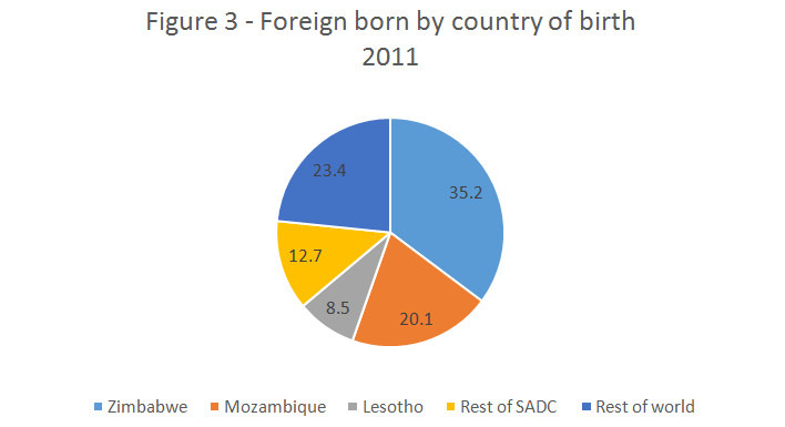
And finally, the map below indicates the municipalities (as they were in 2011) where foreigners were concentrated in 2011. The dark green municipalities contained more than 30 000 foreign born residents in 2011, and the light green municipalities indicate that more than 3% of the population (but fewer than 30 000) was foreign born. The results are what one would expect: large numbers of foreign born residents in the large metros and concentration along the north-eastern, northern and north-western boundaries, as well some municipalities near Lesotho.
Conclusion
The main conclusions of this study are (a) that the proportion of the population which was foreign born was remarkably stable between 2011 and 2016, (b) that immigration and emigration are closely matched, (c) that the age distributions of the foreign born in 2011 and 2016 are much the same, and (d) that the proportions of the foreign born population born in Zimbabwe, Mozambique, Lesotho, the rest of SADC and the rest of the world has not been changed by much. The estimate of net migration is very small and its accords with the assumption in the Appendix that net migration has been zero. The accuracy of the picture depends on the validity of that assumption.
About 1 in 25 South African residents is foreign born. The foreign born are geographically concentrated in the metros (where 62% of them lived in 2011) and the northern parts of the country. The pattern has been remarkably stable over recent years. Should Zimbabwe pick itself up from the floor economically, one can expect heightened emigration among the Zimbabwean born over time. On the other hand, there are signs of economic distress in Mozambique, so immigration from that country, already substantial, may increase.
By Charles Simkins, Head of Research, HSF, 13 April 2017
Appendix: Reconciliation Of The Community Survey 2016 With The 10% Sample Fr0m The 2011 Census
Introduction
The purpose of this document is to create a coherent demographic framework using information from the Census 2011 10% sample and the 2016 Community Survey. The information is not coherent as it stands, so adjustments need to be made. The United Nations World Population (2015 revision) estimates and projections will be used in the process of reconciliation.
The purpose for which this reconciliation is carried out is the estimation of international and internal migration, but the framework will have other uses as well.
The reference night for the Census was 9-10 October 2011 and the reference night for the Community Survey was 6-7 March 2016. The gap between the two is 4.41 years. One task is to convert the gap to five years adjusting the sources to mid-2011 and mid-2016.
Coherent estimates satisfy the population equation:
Population in 2016 = Population in 2011 + Births – Deaths + Immigration - Emigration
Table 1 sets out the estimates of population from the Census and Community Survey.
Table 1 – Unadjusted Census and Community Survey estimates
|
National origin |
Census 2011 |
Community Survey 2016 |
Annual growth |
|
South African |
49 591 385 |
54 080 323 |
1.98% |
|
Foreign |
2 179 175 |
1 573 331 |
-7.12% |
|
Total |
51 770 560 |
55 653 654 |
1.65% |
Neither growth rate is plausible. The growth rate for the South African born population is too high, given a crude birth rate of 17.4 per thousand and a crude death rate of 7.9 in the year before the Community Survey. It is also unlikely that the drop in the foreign born population has been rapid as Table 1 indicates.
Table 2 sets out the United Nations population equation for the five year period between 2011 and 2016.
Table 2 - United Nations population equation
|
|
Original |
|
Revised |
|
Population 2011 |
52 233 000 |
|
52 233 000 |
|
Births |
5 559 600 |
|
5 577 800 |
|
Deaths |
3 348 800 |
|
3 348 800 |
|
Net immigration |
520 000 |
|
0 |
|
Population 2016 |
54 963 800 |
|
54 462 000 |
|
UN estimate |
54 982 000 |
|
|
|
Discrepancy |
18 200 |
|
|
|
|
|
|
|
|
Annual growth |
1,03% |
|
0,84% |
|
Crude birth rate |
20,7 |
|
20,9 |
|
Crude death rate |
12,5 |
|
12,6 |
The population growth rate in the United Nations projections is well below that estimated in Table 1. The crude birth rate is higher than indicated in Table 1, and the crude death rate is much higher, suggesting under-enumeration of births and deaths in the Community Survey. Note also that the United Nations estimates net immigration of just over half a million people between 2011 and 2016, sharply at variance with net emigration of just over 600 000 foreign born people implied by Table 1.
It is difficult to decide what assumption should be made about net immigration. The 2016 Community Survey has information about the (most recent) year of arrival of the foreign born, and 405 494 respondents reported that they had arrived in South Africa since the beginning of 2012. Converting the estimate to a five year implies immigration of about 465 000, lower than the United Nations estimate of net immigration, and implying (less than) zero emigration of foreign residents present in 2011, which is implausible.
One of the problems is that some of the foreign born falsely report that they were South African born. One is driven by Table 1 to the assumption that this false reporting intensified between the Census and the Community Survey, though the omission of the institutional population in the Community Survey may have played a role. But it is difficult to imagine that the degree of intensification was such as to imply more than zero net immigration. Even that would involve an adjustment up of the 2016 estimate of the foreign born in Table 1 of over 35%. Accordingly, the assumption is made that net migration of the foreign born to South Africa was zero between 2011 and 2016, giving rise to the revised population equation, which is the anchor for all that follows. The United Nations does not publish the age and sex composition of net migration, but since it is in the direction of immigration, the age and sex structure of immigrants enumerated in the Community Survey will be used to remove the assumed net migration from the UN estimates.
Adjustment of the Census and Community Survey to the UN anchor is achieved by adjusting the person weights in the two samples. Adjustment factors are derived separately for the sexes and by single year of age from 0 to 84 and the grouped age range 85+, by comparison of the relevant distributions. These adjustment factors are applied to the person weights and all subsequent tabulations are based on the revised weights.